Brand Kit
The identity and visual language of tomas.tech. Assets to use, principles to follow, and working examples to explore.
The tomas.tech identity
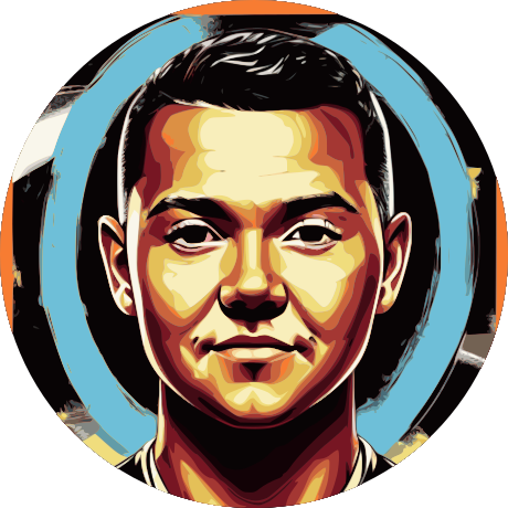
A personal name, a recognisable face, and a place for the work. The lower-case wordmark and portrait connect the website to Tomas Jurkevičius, engineer and maker.

tomas.tech
ENGINEER & MAKER
Keep it recognisable
Use the supplied artwork, preserve its aspect ratio, and leave clear space around the identity. The avatar keeps its authored colours.
Keep it uncomplicated
Avoid stretching, outlining, shadows, or busy backgrounds. The wordmark is typeset in Geist Sans; do not substitute initials or a new symbol.
For questions about using the identity, get in touch.
An engineer’s notebook
Visible structure, quiet surfaces, and room for the work. A small set of decisions connects the projects, writing, and interactive studies across this site.
Engineer.
Maker.
A personal space for things I build and learn.
Explore the Lab- Structure stays visible
- Align to shared columns. Use rules to show how things belong together.
- Reading comes first
- Keep text still, lines comfortable, and background detail quiet.
- Detail has a purpose
- Use drawings to explain construction and accent colour to identify meaning.
- The visitor has control
- Make light, dark, and reduced-motion experiences equally complete.
Personal, precise, curious
Write like the person behind the work. Explain what something does, share the decisions that matter, and leave room for the next question.
- Speak directly
- Use familiar words and active sentences. Name the thing a reader can do next.
- Show the work
- Describe the actual project, experiment, or observation. Let concrete details carry the claim.
- Leave room to learn
- Say when an idea is evolving. Curiosity can be confident without pretending every question is settled.
Colour has a job
Warm paper and cobalt in light mode; charcoal and lavender in dark mode. Choose a colour by its role so the same component works in either theme.
A place for ideas.
Quiet canvas. Clear type. One accent with a purpose.
A place for ideas.
Quiet canvas. Clear type. One accent with a purpose.
Choose the surface before the colour
- Canvas: leave reading and navigation on the page background.
- Surface: give artwork, tools, and documents a solid field.
- Accent: identify an action, a selected state, or meaningful drawing detail.
| Role | Light | Dark |
|---|---|---|
--backgroundThe open canvas for reading and navigation. | #f4f2ec | #17181c |
--foregroundPrimary text and strong linework. | #242429 | #efeee9 |
--mutedSupporting copy, captions, and quiet drawing ink. | #64646e | #aaaab4 |
--separatorRules that explain layout and grouping. | #d5d3ce | #3d3d48 |
--surfaceArtwork, specimens, tools, and documents. | #fbfaf7 | #23242b |
--accentActions, focus, emphasis, and foreground drawings. | #3232ec | #c0beff |
--accent-softSelection and interaction feedback. | #ebeaf6 | #333340 |
--paper aliases --surface; --primary-hover aliases --accent-soft. The footer deliberately reverses the relationship: an accent field with canvas-coloured ink.
Two voices, a clear hierarchy
Geist Sans carries the reading. Geist Mono carries the measurements. Give each role a consistent size and rhythm, then let the difference in scale do the work.
DisplayGeist Sans · shared title token
Ideas take shape.
Section28–36px / 40px · medium
Room for the next thought.
Body17px / 28px · 16px on mobile
A comfortable line of text makes it easier to stay with an idea. Space between paragraphs gives the next one room to begin.
AnnotationGeist Mono · 11px / 16px
FIG. 001 / STRUCTURE & CURIOSITY
Keep prose near a readable measure: these reference pages use 68ch, while articles use a 40rem reading column. Titles balance across lines; body copy stays left-aligned. Shared title sizes adapt to the viewport and the individual composition.
Space makes relationships visible
Use smaller spaces to connect related elements and larger spaces to separate ideas. The site builds that rhythm from a 4px scale, a shared column grid, and a few responsive insets.
FIELD NOTES
Thinking out loud.
Notes from along the way.
Three kinds of space
- Inset
- Space inside a panel. Content sits 28px from the edge on desktop and tablet, 20px on mobile.
- Gap
- Space between related elements. Editorial columns use 24px, reducing to 16px on mobile.
- Margin
- Space outside a composition. The shell uses responsive outer gutters and stops growing at 90rem.
Keep related things together
Put padding on the container and use a shared gap for its children. Panel borders can meet without a gap.
Give a new idea more room
Separate sections with the larger steps. A repeated border belongs inside the spacing calculation, so the rhythm does not drift.
The spacing scale
Each token name is a multiple of 4px at the default browser font size. Reuse these steps instead of inventing a new distance for each component.
--space-1- 4px
- Fine adjustments
--space-2- 8px
- Icon-to-label gaps
--space-3- 12px
- Compact control padding
--space-4- 16px
- Mobile editorial gaps
--space-6- 24px
- Desktop editorial gaps
--space-8- 32px
- Reading offsets and insets
--space-12- 48px
- Mobile section spacing
--space-16- 64px
- Desktop section spacing
--space-20- 80px
- Large composition spacing
--space-24- 96px
- Largest scale step
Responsive layout aliases solve different jobs: --panel-inset is 28/20px; --grid-gap is 24/16px. The shell has 12, 8, or 4 columns, with breakpoints at 1100px and 760px. Outer gutters are 24px through 760px and 16px through 480px.
Familiar parts, consistent behaviour
Destinations are links; actions are buttons. Shared components carry their own geometry and interaction states, so the same action feels familiar wherever it appears.
Try the real states
These controls change the whole site and stay in sync with the header. Use Tab to inspect focus, then Enter or Space to activate them.
Metadata stays quiet
Compact labels describe the work. They do not compete with the title or behave like separate actions.
Icons reinforce meaning
Use Lucide for interface actions. Icon-only controls have a name; icons beside a label are decorative.
Draw, assemble, settle
Movement explains a change or reveals construction. Controls respond quickly, drawings take more time, and ordinary reading text stays still.
--motion-feedback180msA control responds to you.
--motion-enter560msContent arrives in place.
--motion-reveal640msA drawing or rule is revealed.
--motion-settle420msA movement comes to rest.
The background follows its own slower timeline. It pauses in hidden tabs; offscreen studies skip idle work. App or system reduced motion shows the complete resting state without movement.
Explore the structural drawingsAccess is part of the system
Presentation and interaction are checked together. A beautiful state is only useful if someone can reach it, understand it, and leave it.
- Make the structure readable
- Use semantic landmarks, one page title, ordered headings, and a skip link. Keep the complete content in static HTML.
- Make every action reachable
- Keep keyboard order logical, focus visible, and control names useful. Test the target as well as its icon.
- Explain state in more than colour
- Pair colour with labels, rules, icons, or pressed and current-state attributes.
- Respect the visitor’s settings
- Start from system theme and motion preferences, preserve explicit choices, and keep reduced-motion content complete.
Validation includes narrow and wide screens, both themes, keyboard interaction, and app/system reduced motion. These are implementation practices, not a claim of independent accessibility certification.
From a rule to a working page
Shared tokens define the values. UI components define their behaviour. Page features arrange them around the work. Next.js, React, TypeScript, Tailwind CSS, and MDX turn that system into statically exported pages.
- Choose the role. Start with a semantic colour, type role, or spacing token.
- Use the shared part. Reuse buttons, tooltips, cards, and content layouts before adding a variation.
- Check the composition. Review the real copy, keyboard path, themes, and responsive states.
This is a living reference to the website, not a separate component library. See the website project for the broader design and build.